When you study Disney cels from the Xerox years, from 1960 until The Rescuers, it’s amazing to see how much of the animator’s rough drawing was left untouched and made it to the screen. Particularly scenes by Milt Kahl, but also some by Frank, Ollie, Eric Larson and Lounsbery maintained that wonderful unfinished, sketchy look. Some people in the audience might find these loose drawings less pleasant to look at than the previous inked cels, but I am not one of them. The rougher the better!
It’s like seeing the animator’s personal handwriting in motion. Even though Disney had the best clean up artists as well as inkers in the business, when replacing a sketchy line with one thin contour, you are bound to loose some of the drawing’s liveliness.
Milt said:” It’s too bad that Xerox happened so late in life. I was talking to Walt on Peter Pan and said, why don’t we just reproduce the animators’ roughs. But he responded, no, no, you want that nice, fine line around the characters. He eventually changed his mind though.”
I believe Walt had no choice but to accept the Xerox process, since inking contributed to the ever growing production budgets. Moviegoers in those days embraced the new look and accepted the idea that rough drawings could become engaging characters and tell a compelling story.
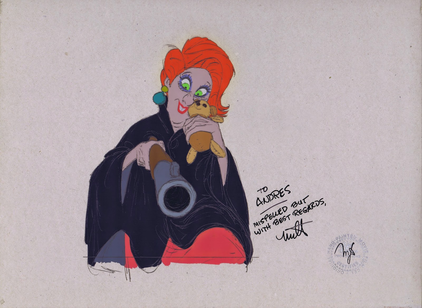
When the studio produced The Rescuers, it was Milt again who championed the use of a Xerox line, this time in grey, which softened the drawings somewhat.
I still prefer a black loose line around the characters though. If the drawing is good, why not commit to it and be bold with it?!
The cel above was signed by Milt during my first get together with him.
The other ones are from his scenes as well ,and show his wonderful uncompromised line work.


